This report was prepared for vokalu.com. It shows the top findings; the full report includes every issue and its fix.
What the scores mean
No change since the scan on Nov 15, 2026.
Clean bill of health since Oct 6, 2026, serial WO-2026-1070. View the certificate
Opportunities
No critical or high-severity issues. That's the bar most sites miss.
Diagnostics
Worth fixing. Not an emergency.
No security.txt for vulnerability reports~5 min
A /.well-known/security.txt file tells researchers how to report a problem before it becomes a breach. Two lines: Contact and Expires.
RFC 9116; expected by many bug-bounty and disclosure norms.
AI design tells
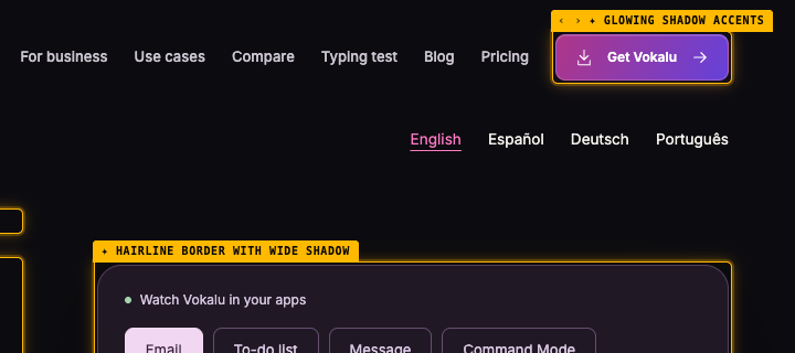
25 patterns on this page read as AI-generated: Kicker / eyebrow label above heading, Hairline border with wide shadow, Glowing shadow accents. Visitors have learned to recognize these; they read as a template and cost trust. Each one has a specific fix.
Kicker / eyebrow label above heading8×
A tiny tracked uppercase or small-caps label sitting as its own block directly above a heading is banned outright, repeated or not. Generated kickers never earn their place: the heading carries its own weight. Delete the label and let the heading speak; if the words matter, work them into the heading or the body.
Example: kicker "VOICE TYPING FOR WINDOWS & MAC" above h1 "“Three… actually, four.”Vokalu types “four.”"
Hairline border with wide shadow5×
A hairline border paired with a wide, diffuse shadow is a recurring generated-UI signature. Commit to one — a defined edge or a soft elevation — rather than both at once.
Example: 1px border + 18px shadow blur
Glowing shadow accents4×
Colored glow shadows — a zero-offset chromatic halo (box- or text-shadow) on any background, or any colored blurred shadow on a dark background — are the default "cool" look of AI-generated UIs. Use neutral elevation shadows and subtle, purposeful lighting instead.
Example: Colored box-shadow glow (#9c48ec) on dark background
Decorative radial spotlight glow3×
A soft, low-opacity accent-colored radial gradient fading to transparent, dropped behind a hero or section as a "spotlight." It is a reflex AI decoration — the translucent cousin of the saturated radial halo. Let the surface stand on its own, or light the composition with a deliberate material accent rather than a floating colored haze.
Example: radial-gradient spotlight glow "meetings-card" (#3a2344 a0.40 → transparent) on 543x496 surface
Gradient text2×
Gradient text is decorative rather than meaningful — a common AI tell, especially on headings and metrics. Use solid colors for text.
Example: background-clip: text + gradient
Crushed letter spacing1×
Letter-spacing pulled tighter than the point where characters keep their own shapes costs legibility. Tighten display type optically, not destructively.
Example: letter-spacing: -0.06em — "“Three… actually, four.”Vokalu types “fo"
Oversized hero headline1×
A full-sentence headline set at display size ends up dominating the viewport, leaving no room for anything else above the fold. A punchy one- or two-word headline at that size is fine — the problem is a long headline blown up too large. Set long headlines smaller, or tighten the copy.
Example: 79px h1, 44 chars, 40vh "“Three… actually, four.”Vokalu types “four.”"
AI color palette1×
Purple/violet gradients and cyan-on-dark are the most recognizable tells of AI-generated UIs. Choose a distinctive, intentional palette.
Example: Purple/violet gradient background
Undersized functional text · quality22×
Interactive and content-bearing UI text (links, buttons, nav items, labels, table cells, meta rows, timecodes) below 11px is a legibility failure, not a style choice. WCAG sets no absolute pixel floor, but functional text under 11px is a defensible quality bar: it fails on high-DPI and small viewports and it degrades tap and read targets. The 11px floor holds even inside a footer; only non-interactive legal smallprint gets the softer 10px floor. Being ON the DESIGN.md size ramp does not exempt a value here: adding 8px to the ramp launders the token but not the legibility problem, and that is exactly the escape hatch this rule closes. Exempts sup/sub, visually-hidden (sr-only) text, and code/terminal contexts. Decorative letterspaced micro-labels are still functional and stay in scope.
Example: 9px functional text "YOU SAY IT" (below 11px floor)
Tiny body text · quality11×
Body text below 12px is hard to read, especially on high-DPI screens. Use at least 14px for body content, 16px is ideal.
Example: 11px body text
Line length too long · quality9×
Text lines wider than ~80 characters are hard to read. The eye loses its place tracking back to the start of the next line. Add a max-width (65ch to 75ch) to text containers.
Example: ~232 chars/line (aim for <80)
Wide letter spacing on body text · quality6×
Letter spacing above 0.05em on body text disrupts natural character groupings and slows reading. Reserve wide tracking for short uppercase labels only.
Example: letter-spacing: 0.14em on body text
Heading crowded against the previous block · quality3×
A heading binds to the content it introduces, so the rendered space above it should exceed the space below it. When headings across a page sit as close or closer to the block above than to their own content, every section reads as if it captions the previous one. Open up the space above each heading.
Example: h4 "Attendees and context" has 46px above vs 66px below — it reads as bound to the block above (3 headings on page)
Skipped heading level · quality1×
Heading levels should not skip (e.g. h1 then h3 with no h2). Screen readers use heading hierarchy for navigation. Skipping levels breaks the document outline.
Example: <h1> "“Three… actually, four.”Vokalu types “four.”" followed by <h3> "On-screen dictation" (missing h2)
Full annotated page (77 labels)

This report is complete and free, and true as of the scan time above. The next deploy, a tag added in Tag Manager or a redesigned footer can change it. Watch re-checks vokalu.com every day and after every deploy, emails you the moment something regresses, keeps the dated record, and gives you a trust page your customers can check.
Watch vokalu.comTrust page draftPassed audits
(11)
Privacy policy is present
A privacy policy link or page was found.
Privacy policy covers the expected disclosures
3073 words; 14 disclosure checks passed; last updated October 10, 2026.
No third-party trackers detected
None of the common analytics or marketing pixels were found in the page.
Terms of service are present
A terms page or link was found.
Public contact or business identity present
A contact email, contact page, or mailto link was found.
No secret keys in the page or its scripts
No server-side keys (Stripe secret, OpenAI, Anthropic, AWS, GitHub, Slack, SendGrid, Supabase service_role, private keys) in the page or the 3 script bundles it loads.
4 security headers set
Content-Security-Policy, Strict-Transport-Security, X-Content-Type-Options, X-Frame-Options
No mixed content
All referenced resources use HTTPS.
Legal entity and address are shown
A company name and a postal address appear on the page.
Served over HTTPS
The final URL uses TLS.
No WCAG A/AA violations found (29 rules passed)
axe-core found no violations of the WCAG 2.2 A/AA rules it can test automatically. Automated checks cover roughly a third of WCAG; manual review is still needed for the rest.
Share this report.
The link is public and shows the same free view you see here; nothing about the reader is recorded.
The certificate.
vokalu.com holds Clean Bill of Health WO-2026-1070, last checked November 22, 2026. Open it for the seal and what it verified.
Put your score on your README.
An embeddable badge that re-checks weekly. Builders use it the way they use a CI badge: proof the boring stuff is handled.
[](https://webopsy.tech/s/vokalu.com)